 Apache NetBeans
CSS3 Flexible Box and Oracle JET
| This tutorial needs a review. You can edit it in GitHub following these contribution guidelines. |
This document provides a step-by-step set of instructions guiding you through the process of working with Composite Components in Oracle JavaScript Extension Toolkit (JET) applications. JET empowers web and mobile developers by providing a modular toolkit based on modern JavaScript, CSS3, and HTML5 design and development principles.
Flexible boxes, or flexbox, is a new layout mode in CSS3. Use of flexbox ensures that elements behave predictably when the page layout must accommodate different screen sizes and different display devices. For many applications, the flexible box model provides an improvement over the block model in that it does not use floats, nor do the flex container’s margins collapse with the margins of its contents.
Throughout this lab, you’ll be focused on two specific CSS classes provided by Oracle JET:
-
oj-flex
-
oj-flex-item
You’ll use one or two supporting CSS classes too, specifically, oj-margin and oj-panel .https://netbeans.org/kb/docs/webclient/ojet-databinding.html
References:
Setting Up an Oracle JET Application
In this exercise you set up an Oracle JET application and explore its default content.
-
Follow the steps described in Setting Up an Oracle JET Application.
-
Open the project into an editor or IDE of your choice, such as NetBeans IDE, which displays the application as follows:
Spend some time browsing through the application structure. In the next section, you’ll be introduced to the main concepts of the application structure.
Experimenting with FlexBox in Oracle JET
-
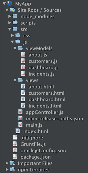
In "incidents.html", let’s start simply like this:
<div class="oj-flex-item">
</div>
. Right now, what we’ve got is one "div", which has been set as an "oj-flex-item". It has nothing in it and you can’t tell that it’s there when you look in the page, which will just be blank, aside from the "h1" content. A good tip when doing layouting with Flex Layout, i.e., at least during development, is to add an "oj-panel":
<div class="oj-flex-item oj-panel">
</div>
In the browser, you now see a little border, and you can tell where the flex-item is rendered:
Therefore, the "oj-panel" is very useful when laying out items, to see where the containers and items are fitting within the page, regardless of whether you ultimately want to use "oj-panel" in the actual release of your product. It enables you to see what the padding is, while you can also use different colors in the background by using different alternate panels, via "oj-panel-alt".
-
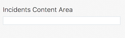
If that is our first row, let’s put that in there:
<div class="oj-flex-item oj-panel">
   first row
</div>
Of course, the above will have this result:
-
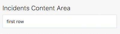
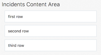
Then copy that and put in a few of them, as follows:
<div class="oj-flex-item oj-panel">
    first row
</div>
<div class="oj-flex-item oj-panel">
    second row
</div>
<div class="oj-flex-item oj-panel">
    third row
</div>
-
As you can see, the items are stacking up, they’re looking OK, though they definitely don’t have the padding around them that we would like, according to the Oracle Alta UI. Let’s add a margin to each item, as follows:
<div class="oj-flex-item oj-panel oj-margin">
    first row
</div>
<div class="oj-flex-item oj-panel oj-margin">
    second row
</div>
<div class="oj-flex-item oj-panel oj-margin">
    third row
</div>
Now we have some padding in there:
That’s the default that "oj-margin" gives us, from the Oracle Alta UI spec. Rather than overriding it, if needed, the better approach is to create your own CSS margin class, since the various Oracle JET components also make use of "oj-margin" and hence if you change "oj-margin" itself, you may end up with unintended side effects.
-
Where we are now is that we have three "oj-flex-items", which are all contained by the "oj-flex" container in "index.html". Now, let’s say that in the second row, i.e., the second "oj-flex-item", we want to put three or four other items:
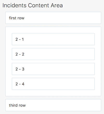
Getting to the above point is as simple as nesting new "oj-flex-items", like this, i.e., below, only the items in bold have been added:
<div class="oj-flex-item oj-panel oj-margin">
first row
</div>
<div class="oj-flex-item oj-panel oj-margin">
*<div class="oj-flex-item oj-panel oj-margin">
2 - 1
</div>
<div class="oj-flex-item oj-panel oj-margin">
2 - 2
</div>
<div class="oj-flex-item oj-panel oj-margin">
2 - 3
</div>
<div class="oj-flex-item oj-panel oj-margin">
2 - 4
</div>*
</div>
<div class="oj-flex-item oj-panel oj-margin">
third row
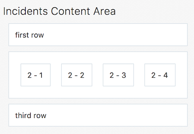
</div>. However, probably you don’t need that whole border along the outside of the second level items. And maybe you want them to be side-by-side, instead. Right now, we have an "oj-flex-item", which contains other instances of "oj-flex-item". Since they’re all "items", they’re still children of the "container" item in the "index.html" page. Really, what you would like is for the second level items to be items for the "div" element that contains them. Therefore, let’s add in an "oj-flex", which will turn that "div" element into a container:
<div class="*oj-flex* oj-flex-item oj-panel oj-margin">
<div class="oj-flex-item oj-panel oj-margin">
2 - 1
</div>
<div class="oj-flex-item oj-panel oj-margin">
2 - 2
</div>
<div class="oj-flex-item oj-panel oj-margin">
2 - 3
</div>
<div class="oj-flex-item oj-panel oj-margin">
2 - 4
</div>
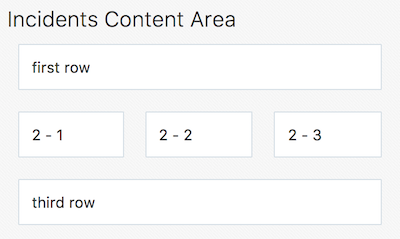
</div>The above is the only change we have made and now we have the following layout:
-
Once you set a "div" as being a container, you enable it to control its own content. By default, containers flow in a row, as you can see above. The "flex-direction" property is, by default, set to "row". You can set that to "column", instead, as will be shown later, as well as "reverse row" and "reverse column". The reverse classes probably might mess things up for RTL languages, which Oracle JET automatically incorporates. You can also mess with the order, overriding the DOM order, which might cause conflicts with accessibility requirements and RTL language support, though. Be aware that this flexibility exists, if needed, as well as the problems that might occur.
-
If you remove "oj-panel" and "oj-margin" from that "div" element, you will have a layout like this:
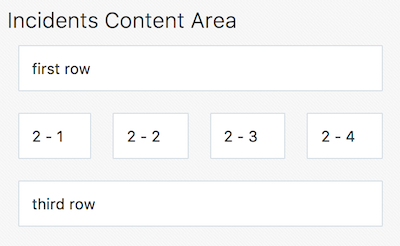
The inner items are now all in a row, without a panel around them. Once you set up a container, by default, the items inside it are going to resize to fit the container. So, if you remove one of the inner items, in "incidents.html", you will automatically have the resize effect and the result will be as follows:
Automatically, the inner items stretch across and take up the space in order to position the three items equally.
Let’s now go a step further and add inner items to the third "div", after making that "div" a container, while removing its panel and margin. We’ll also put back the fourth inner item in the second "div", as a starting point:
<div class="oj-flex-item oj-panel oj-margin">
    first row
</div>
<div class="oj-flex oj-flex-item">
    <div class="oj-flex-item oj-panel oj-margin">
        2 - 1
    </div>
    <div class="oj-flex-item oj-panel oj-margin">
        2 - 2
    </div>
    <div class="oj-flex-item oj-panel oj-margin">
        2 - 3
    </div>
    <div class="oj-flex-item oj-panel oj-margin">
        2 - 4
    </div>
</div>
<div class="oj-flex oj-flex-item">
    <div class="oj-flex-item oj-panel oj-margin">
        3 - 1
    </div>
    <div class="oj-flex-item oj-panel oj-margin">
        3 - 2
    </div>
</div>
The result is as follows:
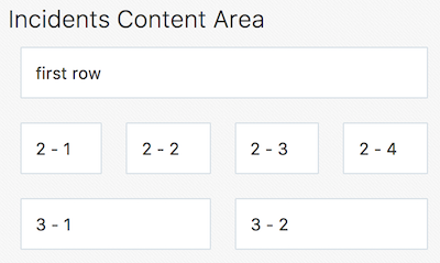
There are now 4 columns in the middle and 2 across the bottom. As you resize this, the rows are maintained, becoming smaller and smaller as you make the browser smaller.
-
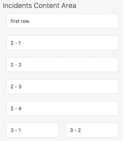
However, let’s say that we want the items in the second row to stack as we move smaller, i.e., as we get to a phone-size resolution. Since items inherit from their container, we’ll use the "flex-direction" property, mentioned earlier, to switch from the default "row" direction to "column", when the resolution is "small", i.e., on mobile devices. Take note of the addition below, in bold:
<div class="*oj-sm-flex-direction-column* oj-flex oj-flex-item">
    <div class="oj-flex-item oj-panel oj-margin">
        2 - 1
    </div>
    <div class="oj-flex-item oj-panel oj-margin">
        2 - 2
    </div>
    <div class="oj-flex-item oj-panel oj-margin">
        2 - 3
    </div>
    <div class="oj-flex-item oj-panel oj-margin">
        2 - 4
    </div>
</div>
The above causes a problem immediately because even when you’re not in a small resolution, the rows are now columns, while we only wanted that for small resolutions. Be aware that when you use these resolution-related breakpoints, the related CSS classes work from whatever size you tell them on up. In this particular case, we’re telling the items in a container to be small, and on up. When you look in my page, of course it’s going to drop into a columnar layout, even on large and extra large.
If we only want the columnar direction on small, there are classes for small only, notice the difference below:
<div class="*oj-sm-only-flex-direction-column* oj-flex oj-flex-item">And now, only when the resolution is small, will you see the columnar layout:
Also notice that the container below the one we’ve been working with is still making use of the default "row" direction.
Congratulations! You have now learned how to work with FlexBox in your Oracle JET applications.
See Also
For more information about support for Oracle JET and a variety of HTML5 applications in the IDE on netbeans.org, see the following resources:
-
"Learn" section on the Oracle JET site. A set of official Oracle JET learning resources.
-
Working with CSS Style Sheets in HTML5 Applications. A document that continues with the application that you created in this tutorial that demonstrates how to use some of the CSS wizards and windows in the IDE and how to use the Inspect mode in the Chrome browser to visually locate elements in your project sources.
-
Debugging and Testing JavaScript in HTML5 Applications. A document that demonstrates how the IDE provides tools that can help you debug and test JavaScript files in the IDE.
